DA-100 : Analyzing Data with Microsoft Power BI : Part 04
-
Case study
This is a case study. Case studies are not timed separately. You can use as much exam time as you would like to complete each case. However, there may be additional case studies and sections on this exam. You must manage your time to ensure that you are able to complete all question included on this exam in the time provided.
To answer the questions included in a case study, you will need to reference information that is provided in the case study. Case studies might contain exhibits and other resources that provide more information about the scenario that is described in the case study. Each question is independent of the other question on this case study.
At the end of this case study, a review screen will appear. This screen allows you to review your answers and to make changes before you move to the next section of the exam. After you begin a new section, you cannot return to this section.
To start the case study
To display the first question on this case study, click the Next button. Use the buttons in the left pane to explore the content of the case study before you answer the questions. Clicking these buttons displays information such as business requirements, existing environment, and problem statements. If the case study has an All Information tab, note that the information displayed is identical to the information displayed on the subsequent tabs. When you are ready to answer a question, click the Question button to return to the question.Overview. General Overview
Northwind Traders is a specialty food import company.
The company recently implemented Power BI to better understand its top customers, products, and suppliers.
Overview. Business Issues
The sales department relies on the IT department to generate reports in Microsoft SQL Server Reporting Services (SSRS). The IT department takes too long to generate the reports and often misunderstands the report requirements.
Existing Environment. Data Sources
Northwind Traders uses the data sources shown in the following table.
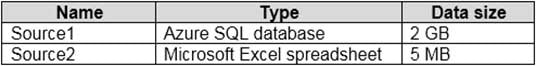
DA-100 Analyzing Data with Microsoft Power BI Part 04 Q01 086 Source2 is exported daily from a third-party system and stored in Microsoft SharePoint Online.
Existing Environment. Customer Worksheet
Source2 contains a single worksheet named Customer Details. The first 11 rows of the worksheet are shown in the following table.
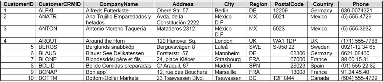
DA-100 Analyzing Data with Microsoft Power BI Part 04 Q01 087 All the fields in Source2 are mandatory.
The Address column in Customer Details is the billing address, which can differ from the shipping address.
Existing Environment. Azure SQL Database
Source1 contains the following table:
– Orders
– Products
– Suppliers
– Categories
– Order Details
– Sales EmployeesThe Orders table contains the following columns.
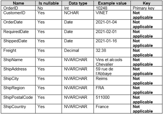
DA-100 Analyzing Data with Microsoft Power BI Part 04 Q01 088 The Order Details table contains the following columns.

DA-100 Analyzing Data with Microsoft Power BI Part 04 Q01 089 The address in the Orders table is the shipping address, which can differ from the billing address.
The Products table contains the following columns.
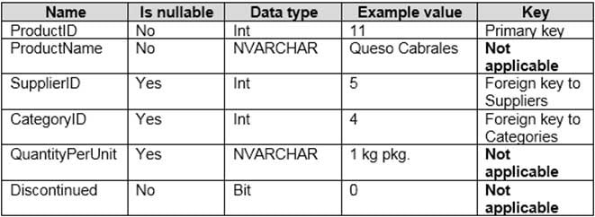
DA-100 Analyzing Data with Microsoft Power BI Part 04 Q01 090 The Categories table contains the following columns.
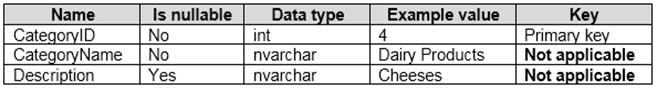
DA-100 Analyzing Data with Microsoft Power BI Part 04 Q01 091 The Suppliers table contains the following columns.

DA-100 Analyzing Data with Microsoft Power BI Part 04 Q01 092 The Sales Employees table contains the following columns.

DA-100 Analyzing Data with Microsoft Power BI Part 04 Q01 093 Each employee in the Sales Employees table is assigned to one sales region. Multiple employees can be assigned to each region.
Requirements. Report Requirements
Northwind Traders requires the following reports:
– Top Products
– Top Customers
– On-Time ShippingThe Top Customers report will show the top 20 customers based on the highest sales amounts in a selected order month or quarter, product category, and sales region.
The Top Products report will show the top 20 products based on the highest sales amounts sold in a selected order month or quarter, sales region, and product category. The report must also show which suppliers provide the top products.
The On-Time Shipping report will show the following metrics for a selected shipping month or quarter:
– The percentage of orders that were shipped late by country and shipping region
– Customers that had multiple late shipments during the last quarterNorthwind Traders defines late orders as those shipped after the required shipping date.
The warehouse shipping department must be notified if the percentage of late orders within the current month exceeds 5%.
The reports must show historical data for the current calendar year and the last three calendar years.
Requirements. Technical Requirements
Northwind Traders identifies the following technical requirements:
– A single dataset must support all three reports.
– The reports must be stored in a single Power BI workspace.
– Report data must be current as of 7 AM Pacific Time each day.
– The reports must provide fast response times when users interact with a visualization.
– The data model must minimize the size of the dataset as much as possible, while meeting the report requirements and the technical requirements.Requirements. Security Requirements
Access to the reports must be granted to Azure Active Directory (Azure AD) security groups only. An Azure AD security group exists for each department.
The sales department must be able to perform the following tasks in Power BI:
– Create, edit, and delete content in the reports.
– Manage permissions for workspaces, datasets, and report.
– Publish, unpublish, update, and change the permissions for an app.
– Assign Azure AD groups role-based access to the reports workspace.Users in the sales department must be able to access only the data of the sales region to which they are assigned in the Sales Employees table.
Power BI has the following row-level security (RLS) Table filter DAX expression for the Sales Employees table.
[EmailAddress] = USERNAME()
RLS will be applied only to the sales department users. Users in all other departments must be able to view all the data.
-
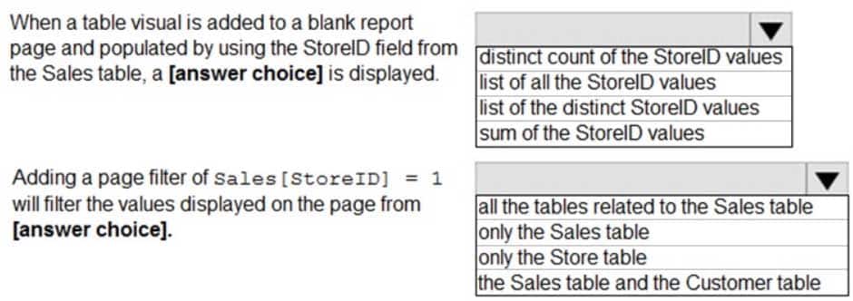
You need to create the On-Time Shipping report. The report must include a visualization that shows the percentage of late orders.
Which type of visualization should you create?
- bar chart
- scatterplot
- pie chart
Explanation:Scenario: The On-Time Shipping report will show the following metrics for a selected shipping month or quarter:
The percentage of orders that were shipped late by country and shipping region
Customers that had multiple late shipments during the last quarterNote: Bar and column charts are some of the most widely used visualization charts in Power BI. They can be used for one or multiple categories. Both these chart types represent data with rectangular bars, where the size of the bar is proportional to the magnitude of data values.
The difference between the two is that if the rectangles are stacked horizontally, it is called a bar chart. If the rectangles are vertically aligned, it is called a column chart.
-
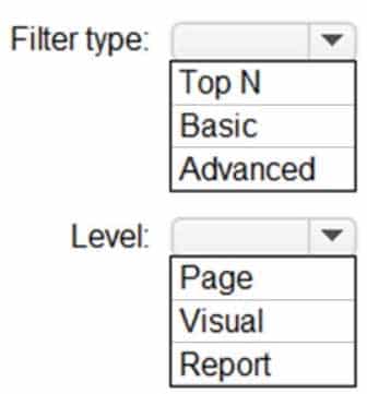
HOTSPOT
You need to create the Top Customers report.
Which type of filter should you use, and at which level should you apply the filter? To answer, select the appropriate options in the answer area.
NOTE: Each correct selection is worth one point.
DA-100 Analyzing Data with Microsoft Power BI Part 04 Q01 094 Question 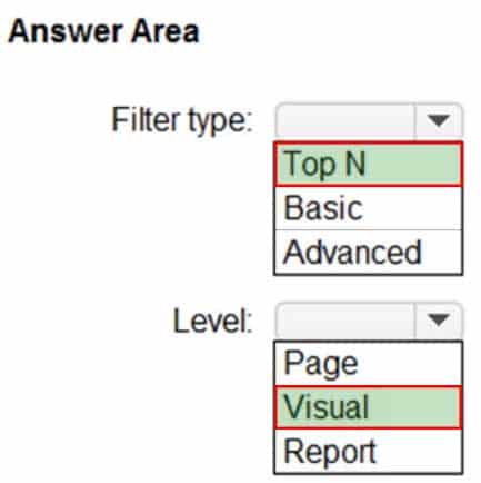
DA-100 Analyzing Data with Microsoft Power BI Part 04 Q01 094 Answer Explanation:Box 1: Top N
Scenario: The Top Customers report will show the top 20 customers based on the highest sales amounts in a selected order month or quarter, product category, and sales region.Once you drag to SKU to Visual level filter you should get Top N option
Note: The two most common filter types: automatic and manual.
Then there are more advanced filters.Box 2: Visual
Once you drag to SKU to Visual level filter you should get Top N option.
-
-
Note: This question is part of a series of questions that present the same scenario. Each question in the series contains a unique solution that might meet the stated goals. Some question sets might have more than one correct solution, while others might not have a correct solution.
After you answer a question in this scenario, you will NOT be able to return to it. As a result, these questions will not appear in the review screen.
You have a clustered bar chart that contains a measure named Salary as the value and a field named Employee as the axis. Salary is present in the data as numerical amount representing US dollars.
You need to create a reference line to show which employees are above the median salary.
Solution: You create an average line by using the Salary measure.
Does this meet the goal?
- Yes
- No
Explanation:
Instead create a percentile line by using the Salary measure and set the percentile to 50%.
Note: The 50th percentile is also known as the median or middle value where 50 percent of observations fall below.
-
Note: This question is part of a series of questions that present the same scenario. Each question in the series contains a unique solution that might meet the stated goals. Some question sets might have more than one correct solution, while others might not have a correct solution.
After you answer a question in this scenario, you will NOT be able to return to it. As a result, these questions will not appear in the review screen.
You have a clustered bar chart that contains a measure named Salary as the value and a field named Employee as the axis. Salary is present in the data as numerical amount representing US dollars.
You need to create a reference line to show which employees are above the median salary.
Solution: You create a percentile line by using the Salary measure and set the percentile to 50%.
Does this meet the goal?
- Yes
- No
Explanation:The 50th percentile is also known as the median or middle value where 50 percent of observations fall below. -
You have a Microsoft SharePoint Online site that contain several document libraries.
One of the document libraries contains manufacturing reports saved as Microsoft Excel files. All the manufacturing reports have the same data structure.
You need to use Power BI Desktop to load only the manufacturing reports to a table for analysis.
What should you do?
- Get data from a SharePoint folder, enter the site URL, and then select Combine & Load.
- Get data from a SharePoint list and enter the site URL. Select Combine & Transform, then filter by the folder path to the manufacturing reports library.
- Get data from a SharePoint folder and enter the site URL. Select Combine & Transform, then filter by the folder path to the manufacturing reports library.
- Get data from a SharePoint list, enter the site URL, and then select Combine & Load.
-
HOTSPOT
You have a report page that contains the visuals shown in the following exhibit.
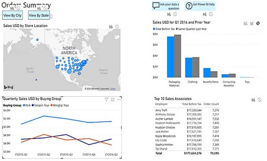
DA-100 Analyzing Data with Microsoft Power BI Part 04 Q05 095 Use the drop-down menus to select the answer choice that completes each statement based on the information presented in the graphic.
NOTE: Each correct selection is worth one point.
DA-100 Analyzing Data with Microsoft Power BI Part 04 Q05 096 Question 
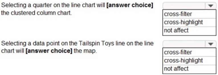
DA-100 Analyzing Data with Microsoft Power BI Part 04 Q05 096 Answer Explanation:Box 1: not affect
The column chart has the no impact icon highlighted, thus selecting data points on the line graph will have no affect on the column chart.Box 2: cross-filter
The map has the cross-filter icon highlighted, thus selecting data points on the line graph will be cross filtered onto the map. -
You have a report that contains four pages. Each page contains slicers for the same four fields.
Users report that when they select values in a slicer on one page, the selections are not persisted on other pages.
You need to recommend a solution to ensure that users can select a value once to filter the results on all the pages.
What are two possible recommendations to achieve this goal? Each correct answer presents a complete solution.
NOTE: Each correct selection is worth one point.
- Replace the slicers with report-level filters.
- Sync the slicers across the pages.
- Create a bookmark for each slicer value.
- Replace the slicers with page-level filters.
- Replace the slicers with visual-level filters.
Explanation:A: Add a report-level filter to filter an entire report.
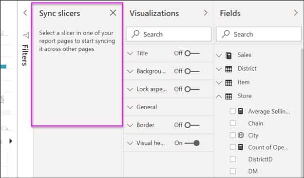
The visuals on the active page, and on all pages in the report, change to reflect the new filter.B: You can sync a slicer and use it on any or all pages in a report.
1. On the Power BI Desktop View menu, select Sync slicers.
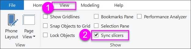
DA-100 Analyzing Data with Microsoft Power BI Part 04 Q06 097 The Sync slicers pane appears between the Filters and Visualizations panes.
DA-100 Analyzing Data with Microsoft Power BI Part 04 Q06 098 -
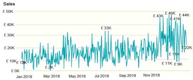
You plan to create the chart shown in the following exhibit.
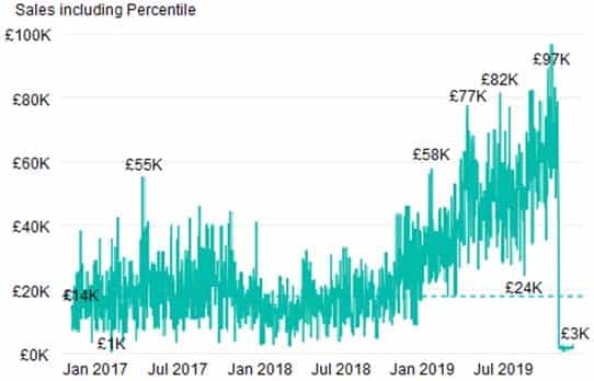
DA-100 Analyzing Data with Microsoft Power BI Part 04 Q07 099 How should you create the dashed horizontal line denoting the 40th percentile of daily sales for the period shown?
- Add a measure to the visual that uses the following DAX expression.
Measure1 = PERCENTILEX.INC (Sales,Sales[Total Sales],0.40)
- Add a new percentile line that uses Total Sales as the measure and 40% as the percentile.
- Create a horizontal line that has a fixed value of 24,000.
- Add a measure to the visual that uses the following DAX expression.
Measure1 = PERCENTILEX.EXC (Sales,Sales[Total Sales],0.40)
Explanation:The analytics feature enables you to show percentiles across groups specified along a specific axis.
Example:
1. Click on the analytics tab
2. Select Percentile
3. You can choose a specific percentile along with other formatting options.
4. Drag a date or non-numeric dimension into the Axis of a column chart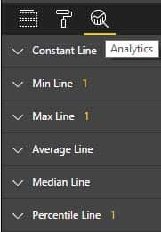
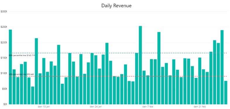
DA-100 Analyzing Data with Microsoft Power BI Part 04 Q07 100 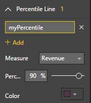
DA-100 Analyzing Data with Microsoft Power BI Part 04 Q07 101 Add percentile lines to monitor daily revenue
DA-100 Analyzing Data with Microsoft Power BI Part 04 Q07 102 Incorrect Answers:
A, D: There are two main percentile functions in Power BI:PERCENTILE.EXC(column, kth percentile)
PERCENTILE.INC(column, kth percentile)
The first parameter is the column which you want the percentile value for.
The second parameter is the kth percentile where k percentage of values will fall below.Both formulas use a slightly different algorithm. The second algorithm works for any value of k between 0 and 1 (the 0th and 100th percentile). In the EXC version the data excludes both lower and upper bounds, while INC includes them.
- Add a measure to the visual that uses the following DAX expression.
-
You have a table that contains sales data and approximately 1,000 rows.
You need to identify outliers in the table.
Which type of visualization should you use?
- donut chart
- pie chart
- area chart
- scatter plot
Explanation:Outliers are those data points that lie outside the overall pattern of distribution & the easiest way to detect outliers is though graphs. Box plots, Scatter plots can help detect them easily. -
HOTSPOT
You need to create a visual as shown in the following exhibit.
DA-100 Analyzing Data with Microsoft Power BI Part 04 Q09 103 The indicator color for Total Sales will be based on % Growth to Last Year.
The solution must use the existing calculations only.
How should you configure the visual? To answer, select the appropriate options in the answer area.
NOTE: Each correct selection is worth one point.
DA-100 Analyzing Data with Microsoft Power BI Part 04 Q09 104 Question 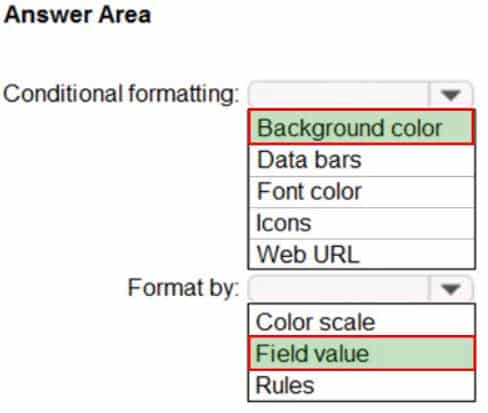
DA-100 Analyzing Data with Microsoft Power BI Part 04 Q09 104 Answer Explanation:Box 1: Background color
To format the Color column based on its field values, select Conditional formatting for the Color field, and then select Background color or Font color.In the Background color or Font color dialog box, select Field value from the Format by drop-down field.
Box 2: Field value
With conditional formatting for tables in Power BI Desktop, you can specify customized cell colors, including color gradients, based on field values. -
Note: This question is part of a series of questions that present the same scenario. Each question in the series contains a unique solution that might meet the stated goals. Some question sets might have more than one correct solution, while others might not have a correct solution.
After you answer a question in this scenario, you will NOT be able to return to it. As a result, these questions will not appear in the review screen.
You have a clustered bar chart that contains a measure named Salary as the value and a field named Employee as the axis. Salary is present in the data as numerical amount representing US dollars.
You need to create a reference line to show which employees are above the median salary.
Solution: You create a constant line and set the value to .5.
Does this meet the goal?
- Yes
- No
Explanation:Instead create a percentile line by using the Salary measure and set the percentile to 50%.
Note: The 50th percentile is also known as the median or middle value where 50 percent of observations fall below.
-
You need to create a visualization that compares revenue and cost over time.
Which type of visualization should you use?
- stacked area chart
- donut chart
- line chart
- waterfall chart
Explanation:A line chart or line graph displays the evolution of one or several numeric variables. Data points are connected by straight line segments. A line chart is often used to visualize a trend in data over intervals of time – a time series – thus the line is often drawn chronologically.
Example:

DA-100 Analyzing Data with Microsoft Power BI Part 04 Q11 105 Incorrect Answers:
A: Stacked area charts are not appropriate to study the evolution of each individual group: it is very hard to substract the height of other groups at each time point.Note: A stacked area chart is the extension of a basic area chart. It displays the evolution of the value of several groups on the same graphic. The values of each group are displayed on top of each other, what allows to check on the same figure the evolution of both the total of a numeric variable, and the importance of each group.
-
You have a collection of reports for the HR department of your company.
You need to create a visualization for the HR department that shows a historic employee counts and predicts trends during the next six months.
Which type of visualization should you use?
- key influencers
- ribbon chart
- line chart
- scatter chart
Explanation:The best data for forecasting is time series data or uniformly increasing whole numbers. The line chart has to have only one line.
Try forecasting: Try the new forecasting capabilities of Power View today on your own data or with the sample report available as part of the Power BI report samples. To view your own data, upload a workbook with a Power View time series line chart to Power BI for Office 365.
-
Note: This question is part of a series of questions that present the same scenario. Each question in the series contains a unique solution that might meet the stated goals. Some question sets might have more than one correct solution, while others might not have a correct solution.
After you answer a question in this scenario, you will NOT be able to return to it. As a result, these questions will not appear in the review screen.
You have a clustered bar chart that contains a measure named Salary as the value and a field named Employee as the axis. Salary is present in the data as numerical amount representing US dollars.
You need to create a reference line to show which employees are above the median salary.
Solution: You create a median line by using the Salary measure.
Does this meet the goal?
- Yes
- No
Explanation:The 50th percentile is also known as the median or middle value where 50 percent of observations fall below. -
You are developing a sales report that will have multiple pages. Each page will answer a different business question.
You plan to have a menu page that will show all the business questions.
You need to ensure that users can click each business question and be directed to the page where the question is answered. The solution must ensure that the menu page will work when deployed to any workspace.
What should you include on the menu page?
- Create a text box for each business question and insert a link.
- Create a button for each business question and set the action type to Page Navigation.
- Create a Power Apps visual that contains a drop-down list. The drop-down list will contain the business questions.
Explanation:Most apps contain multiple screens. Use the Back and Navigate function to change which screen is displayed. For example, set the OnSelect property of a button to a formula that includes a Navigate function if you want to show a different screen when a user selects that button. -
You are developing a report page. Some users will navigate the report by using a keyboard, and some users will consume the report by using a screen reader.
You need to ensure that the users can consume the content on a report page in a logical order.
What should you configure in Microsoft Power BI Desktop?
- the tab order
- the layer order
- the bookmark order
- the X position
Explanation:If you find yourself unable to navigate to an object or visual while using a keyboard, it may be because the report author has decided to hide that object from the tab order. Report authors commonly hide decorative objects from the tab order. If you find that you cannot tab through a report in a logical manner, you should contact the report author. Report authors can set the tab order for objects and visuals. -
HOTSPOT
You have the Power BI data model shown in the following exhibit.
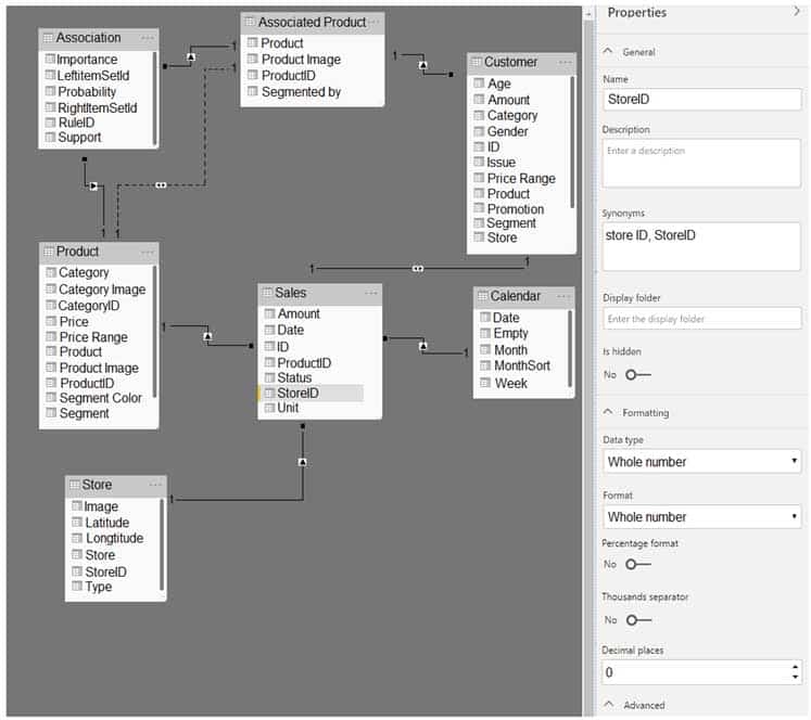
DA-100 Analyzing Data with Microsoft Power BI Part 04 Q16 106 Use the drop-down menus to select the answer choice that completes each statement based on the information presented in the graphic.
NOTE: Each correct selection is worth one point.
DA-100 Analyzing Data with Microsoft Power BI Part 04 Q16 107 Question 
DA-100 Analyzing Data with Microsoft Power BI Part 04 Q16 107 Answer -
You have the visual shown in the Original exhibit. (Click the Original tab.)
DA-100 Analyzing Data with Microsoft Power BI Part 04 Q17 108 You need to configure the visual as shown in the Modified exhibit. (Click the Modified tab.)

DA-100 Analyzing Data with Microsoft Power BI Part 04 Q17 109 What should you add to the visual?
- an Average line
- a forecast
- a measure
- a trendline
Explanation:Explore forecast results by adjusting the desired confidence interval or by adjusting outlier data to see how they affect results.

DA-100 Analyzing Data with Microsoft Power BI Part 04 Q17 110 -
You have a Microsoft Power BI dashboard.
You need to ensure that consumers of the dashboard can give you feedback that will be visible to the other consumers of the dashboard.
What should you use?
- Mark as favorite
- Feedback
- Comments
- Subscribe
Explanation:You can add a personal comment or start a conversation about a dashboard or report with your colleagues. The comment feature is just one of the ways a business user can collaborate with others.
-
You are creating a visual to show the ranking of product categories by sales revenue.
Your company’s security policy states that you cannot send data outside of your Microsoft Power BI tenant.
Which approach provides the widest variety of visuals while adhering to the security policy?
- Use default or certified AppSource visuals.
- Use only default visuals.
- Use default visuals or visuals uploaded from a .pbiviz file.
- Use default or any AppSource visuals from the marketplace.
-
You have a Microsoft Power BI dashboard. The report used to create the dashboard uses an imported dataset from a Microsoft SQL Server data source.
The dashboard is shown in the exhibit. (Click the Exhibit tab.)

DA-100 Analyzing Data with Microsoft Power BI Part 04 Q20 111 What occurred at 12:03:06 PM?
- The dashboard tile cache refreshed.
- A new transaction was added to the data source.
- A user pressed F5.
- A user added a comment to a tile.