DA-100 : Analyzing Data with Microsoft Power BI : Part 05
-
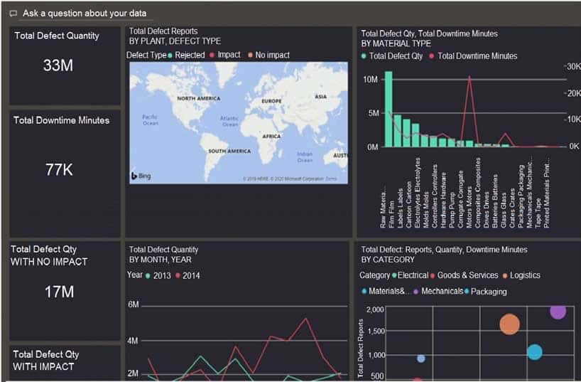
You have a dashboard that contains tiles pinned from a single report as shown in the Original Dashboard exhibit. (Click the Original Dashboard tab.)

DA-100 Analyzing Data with Microsoft Power BI Part 05 Q01 112 You need to modify the dashboard to appear as shown in the Modified Dashboard exhibit. (Click the Modified Dashboard tab.)
DA-100 Analyzing Data with Microsoft Power BI Part 05 Q01 113 What should you do?
- Edit the details of each tile.
- Change the report theme.
- Change the dashboard theme.
- Create a custom CSS file.
Explanation:With Power BI Desktop report themes, you can apply design changes to your entire report, such as using corporate colors, changing icon sets, or applying new default visual formatting. When you apply a report theme, all visuals in your report use the colors and formatting from your selected theme as their defaults. -
DRAG DROP
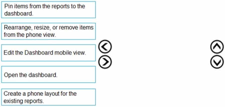
You are using existing reports to build a dashboard that will be viewed frequently in portrait mode on mobile phones.
You need to build the dashboard.
Which four actions should you perform in sequence? To answer, move the appropriate actions from the list of actions to the answer area and arrange them in the correct order.
DA-100 Analyzing Data with Microsoft Power BI Part 05 Q02 114 Question 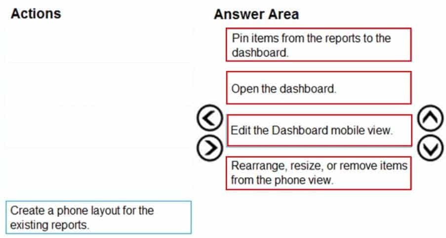
DA-100 Analyzing Data with Microsoft Power BI Part 05 Q02 114 Answer Explanation:In Power bi service you can optimize your power bi dashboard for mobile in 4 steps:
– Pin the items from the reports to the dashboard.
– Open the dashboard.
– Change the dashboard view to Phone view.
– Rearrange, resize or remove the items from the phone view. -
You build a report to help the sales team understand its performance and the drivers of sales.
The team needs to have a single visualization to identify which factors affect success.
Which type of visualization should you use?
- Line and clustered column chart
- Key influencers
- Q&A
- Funnel chart
Explanation:The key influencers visual helps you understand the factors that drive a metric you’re interested in. It analyzes your data, ranks the factors that matter, and displays them as key influencers.
The key influencers visual is a great choice if you want to:
– See which factors affect the metric being analyzed.
– Contrast the relative importance of these factors. For example, do short-term contracts have more impact on churn than long-term contracts? -
HOTSPOT
You have a dataset named Pens that contains the following columns:
– Unit Price
– Quantity OrderedYou need to create a visualization that shows the relationship between Unit Price and Quantity Ordered. The solution must highlight orders that have a similar unit price and ordered quantity.
Which type of visualization and which feature should you use? To answer, select the appropriate options in the answer area.
NOTE: Each correct selection is worth one point.

DA-100 Analyzing Data with Microsoft Power BI Part 05 Q04 115 Question 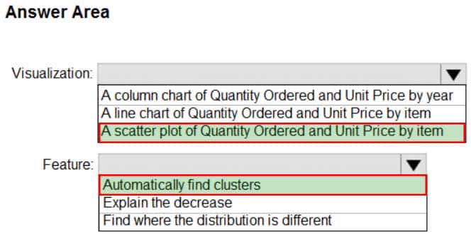
DA-100 Analyzing Data with Microsoft Power BI Part 05 Q04 115 Answer Explanation:Box 1: A scatter plot…
A scatter chart always has two value axes to show: one set of numerical data along a horizontal axis and another set of numerical values along a vertical axis. The chart displays points at the intersection of an x and y numerical value, combining these values into single data points. Power BI may distribute these data points evenly or unevenly across the horizontal axis. It depends on the data the chart represents.Box 2: Automatically find clusters
Scatter charts are a great choice to show patterns in large sets of data, for example by showing linear or non-linear trends, clusters, and outliers. -
You use an R visual to produce a map of 500,000 customers. You include the values of CustomerID, Latitude, and Longitude in the fields sent to the visual. Each customer ID is unique.
In powerbi.com, when users load the visual, they only see some of the customers.
What is the cause of the issue?
- The visual was built by using a different version of R.
- The data comes from a Microsoft SQL Server source.
- The data is deduplicated.
- Too many records were sent to the visual.
Explanation:R visuals in the Power BI service have a few limitations including:
– Data size limitations – data used by the R visual for plotting is limited to 150,000 rows. If more than 150,000 rows are selected, only the top 150,000 rows are used and a message is displayed on the image. Additionally, the input data has a limit of 250 MB. -
You have a line chart that shows the number of employees in a department over time.
You need to see the total salary costs of the employees when you hover over a data point.
What are two possible ways to achieve this goal? Each correct answer presents a complete solution.
NOTE: Each correct selection is worth one point.
- Add a salary to the tooltips.
- Add a salary to the visual filters.
- Add salary to the drillthrough fields.
Explanation:A: When a visualization is created, the default tooltip displays the data point’s value and category. There are many instances when customizing the tooltip information is useful. Customizing tooltips provides additional context and information for users viewing the visual. Custom tooltips enable you to specify additional data points that display as part of the tooltip.
B: Visual Filter applies to a single visual/tile on a report page. You can only see visual level filters selected visual on the report canvas.
Note: This question currently requires two answers. Answer A is 100% correct. Answer B is not correct but it is the next best answer. Should this question should only require one answer, Answer A.
Incorrect Answers:
C: With drill through in Power BI reports, you can create a page in your report that focuses on a specific entity such as a supplier, customer, or manufacturer. When your report readers use drill through, they right-click a data point in other report pages, and drill through to the focused page to get details that are filtered to that context. You can also create a button that drills through to details when they click it. -
You have a report that contains a bar chart and a column chart. The bar chart shows customer count by customer segment. The column chart shows sales by month.
You need to ensure that when a segment is selected in the bar chart, you see which portion of the total sales for the month belongs to the customer segment.
How should the visual interactions be set on the column chart when the bar chart is selected?
- no impact
- highlight
- filter
Explanation:Filters remove all but the data you want to focus on. Highlighting isn’t filtering. It doesn’t remove data, but instead highlights a subset of the visible data; the data that isn’t highlighted remains visible but dimmed. -
HOTSPOT
You have a table that contains the following three columns:
– City
– Total Sales
– OccupationYou need to create a key influencers visualization as shown in the exhibit. (Click the Exhibit tab.)
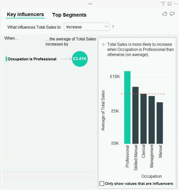
DA-100 Analyzing Data with Microsoft Power BI Part 05 Q08 116 How should you configure the visualization? To answer, select the appropriate options in the answer area.
NOTE: Each correct selection is worth one point.
DA-100 Analyzing Data with Microsoft Power BI Part 05 Q08 117 Question 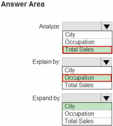
DA-100 Analyzing Data with Microsoft Power BI Part 05 Q08 117 Answer Explanation:Box 1: Total Sales
Box 2: Occupation
Box 3: City
You can use Expand By to add fields you want to use for setting the level of the analysis without looking for new influencers. -
You have the dataset shown in the following exhibit.
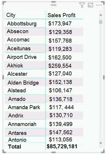
DA-100 Analyzing Data with Microsoft Power BI Part 05 Q09 118 You need to ensure that the visual shows only the 10 cities that have the highest sales profit.
What should you do?
- Add a Top N filter to the visual.
- Configure the Sales Profit measure to use the RANKX function.
- Add a calculated column to the table that uses the TOPN function. In the visual, replace Sales Profit with the calculated column.
- Add a calculated column to the table that returns the city name if the city is in the top 10, otherwise the calculated column will return “Not in Top 10”. In the visual, replace Sales Profit with the calculated column.
Explanation:Power BI Top N Filters are useful to display the top performing records, and Bottom N filters are helpful to display the least performing records. For example, we can display top or bottom 10 products by orders or sales.
Note:
1. Select the Column you want to display the Top Sales Profit
2. Then change the Filter Type of that Column to Top N
3. Fill in Top / Bottom number field
4. And lastly drag to the By Value filed your Sales ProfitIncorrect Answers:
B: You would need a filter as well. -
You have a Power BI report. The report contains visualizations that have interactions.
You need to identify which visualizations take the longest to complete.
What should you use?
- Query Diagnostics in Power BI
- Performance Analyzer in Power BI Desktop
- SQL Server Profiler
- Microsoft Edge DevTools
Explanation:Use Power BI Desktop Performance Analyzer to optimize reports.
In Power BI Desktop you can find out how each of your report elements, such as visuals and DAX formulas, are performing. Using the Performance Analyzer, you can see and record logs that measure how each of your report elements performs when users interact with them, and which aspects of their performance are most (or least) resource intensive. -
DRAG DROP
You have the line chart shown in the exhibit. (Click the Exhibit tab.)

DA-100 Analyzing Data with Microsoft Power BI Part 05 Q11 119 You need to modify the chart to meet the following requirements:
– Identify months that have order counts above the mean.
– Display the mean monthly order count.Which three actions should you perform in sequence? To answer, move the appropriate actions from the list of actions to the answer area and arrange them in the correct order.
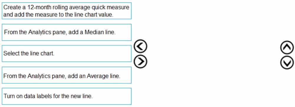
DA-100 Analyzing Data with Microsoft Power BI Part 05 Q11 120 Question 
DA-100 Analyzing Data with Microsoft Power BI Part 05 Q11 120 Answer Explanation:Step 1: Create a 12-month…
You can use calculated measure to get the expected result.
1. Create a calculated column for the date.
2. Create a measure for 12 months moving average.
3. Drag the Line Chart into your canvas as below. (step 2 below)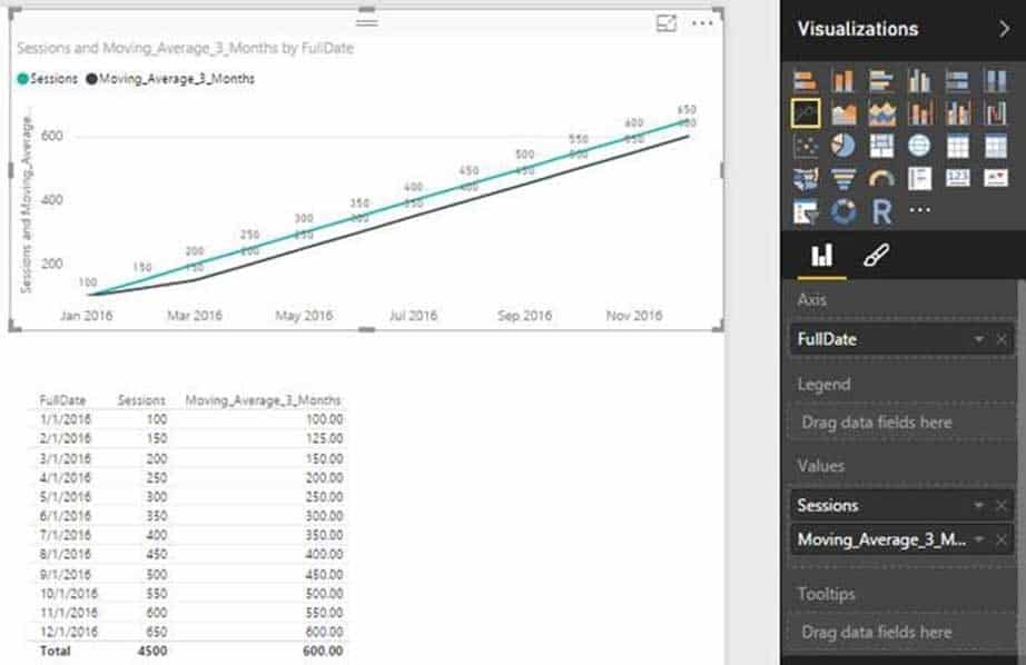
DA-100 Analyzing Data with Microsoft Power BI Part 05 Q11 121 Step 2: Select the line chart
Step 3: From the Analytics pane, add a Average line
-
DRAG DROP
You have a query named Customer that imports CSV files from a data lake. The query contains 50,000 rows as shown in the exhibit. (Click the Exhibit tab.)

DA-100 Analyzing Data with Microsoft Power BI Part 05 Q12 122 Each file contains deltas of any new or modified rows from each load to the data lake. Multiple files can have the same customer ID.
You need to keep only the last modified row for each customer ID.
Which three actions should you perform in sequence? To answer, move the appropriate actions from the list of actions to the answer area and arrange them in the correct order.

DA-100 Analyzing Data with Microsoft Power BI Part 05 Q12 123 Question 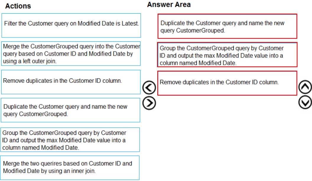
DA-100 Analyzing Data with Microsoft Power BI Part 05 Q12 123 Answer -
HOTSPOT
You view a query named Transactions as shown in the following exhibit.
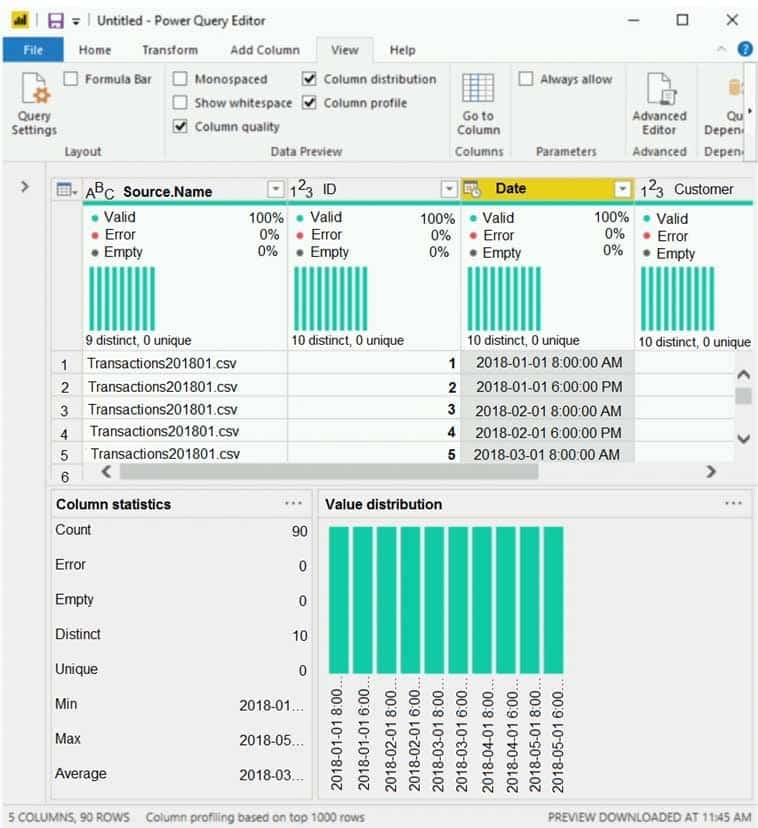
DA-100 Analyzing Data with Microsoft Power BI Part 05 Q13 124 The query gets CSV files from a folder.
Use the drop-down menus to select the answer choice that completes each statement based on the information presented in the graphic.
NOTE: Each correct selection is worth one point.

DA-100 Analyzing Data with Microsoft Power BI Part 05 Q13 125 Question 
DA-100 Analyzing Data with Microsoft Power BI Part 05 Q13 125 Answer Explanation:Box 1: 9
9 distinct CSV files.Box 2: 10
10 distinct dates. -
Your company has employees in 10 states.
The company recently decided to associate each state to one of the following three regions: East, West, and North.
You have a data model that contains employee information by state. The model does NOT include region information.
You have a report that shows the employees by state.
You need to view the employees by region as quickly as possible.
What should you do?
- Create a new aggregation that summarizes by employee.
- Create a new group on the state column and set the Group type to List.
- Create a new group on the state column and set the Group type to Bin.
- Create a new aggregation that summarizes by state.
Explanation:With grouping you are normally working with dimensional attributes.
Here we add three new groups (East, West, and North) and add each state to the appropriate group.Incorrect Answers:
C: You can set the bin size for numerical and time fields in Power BI Desktop. -
HOTSPOT
You are creating a Microsoft Power BI imported data model to perform basket analysis. The goal of the analysis is to identify which products are usually bought together in the same transaction across and within sales territories.
You import a fact table named Sales as shown in the exhibit. (Click the Exhibit tab.)
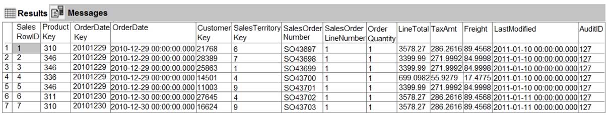
DA-100 Analyzing Data with Microsoft Power BI Part 05 Q15 126 The related dimension tables are imported into the model.
Sales contains the data shown in the following table.
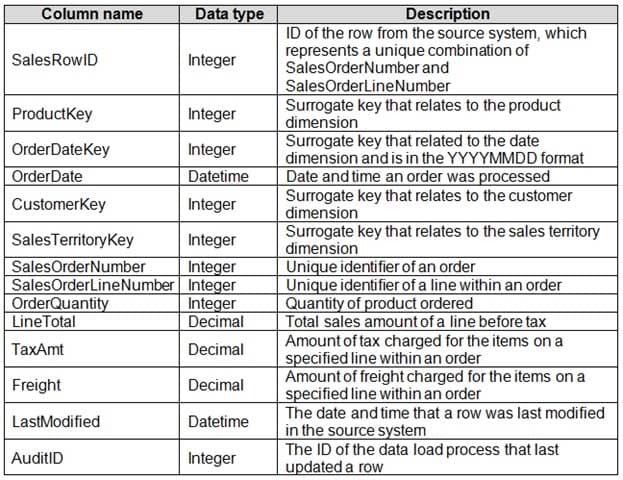
DA-100 Analyzing Data with Microsoft Power BI Part 05 Q15 127 You are evaluating how to optimize the model.
For each of the following statements, select Yes if the statement is true. Otherwise, select No.
NOTE: Each correct selection is worth one point.
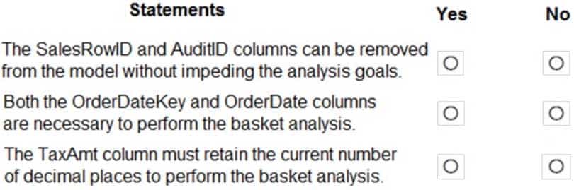
DA-100 Analyzing Data with Microsoft Power BI Part 05 Q15 128 Question 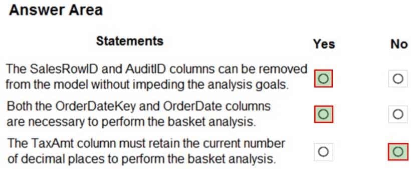
DA-100 Analyzing Data with Microsoft Power BI Part 05 Q15 128 Answer -
HOTSPOT
You are enhancing a Power BI model that has DAX calculations.
You need to create a measure that returns the year-to-date total sales from the same date of the previous calendar year.
Which DAX functions should you use? To answer, select the appropriate options in the answer area.
NOTE: Each correct selection is worth one point.
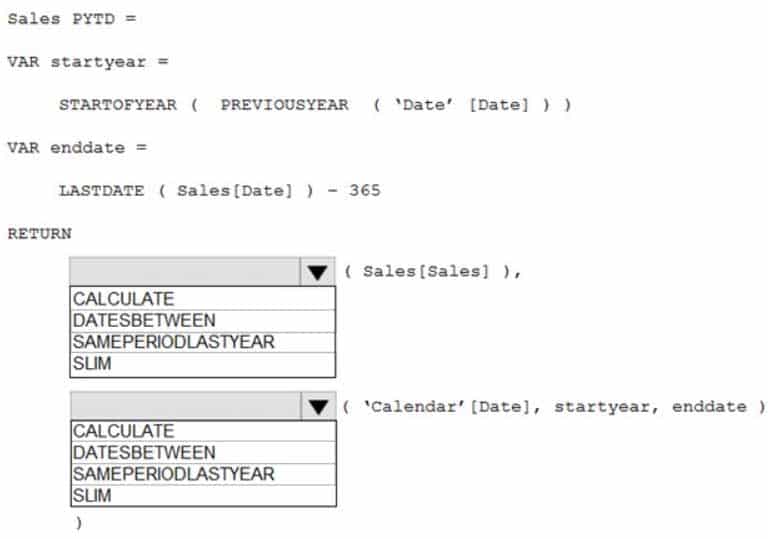
DA-100 Analyzing Data with Microsoft Power BI Part 05 Q16 129 Question 
DA-100 Analyzing Data with Microsoft Power BI Part 05 Q16 129 Answer -
You are configuring a Microsoft Power BI data model to enable users to ask natural language questions by using Q&A.
You have a table named Customer that has the following measure.
Customer Count = DISTINCTCOUNT(Customer[CustomerID])
Users frequently refer to customers as subscribers.
You need to ensure that the users can get a useful result for “subscriber count” by using Q&A. The solution must minimize the size of the model.
What should you do?
- Add a synonym of “subscriber count” to the Customer Count measure
- Add a calculated table named Subscriber that is a duplicate of the Customer table.
- Add a description of “Subscriber” to the Customer table.
- Add a description of “subscriber count” to the Customer Count measure.
Explanation:You can add synonyms to tables and columns.
Note: This step applies specifically to Q&A (and not to Power BI reports in general). Users often have a variety of terms they use to refer to the same thing, such as total sales, net sales, total net sales. You can add these synonyms to tables and columns in the Power BI model.
This step applies specifically to Q&A (and not to Power BI reports in general). Users often have a variety of terms they use to refer to the same thing, such as total sales, net sales, total net sales. You can add these synonyms to tables and columns in the Power BI model.
-
You have the visual shown in the exhibit. (Click the Exhibit tab.)

DA-100 Analyzing Data with Microsoft Power BI Part 05 Q18 130 You need to show the relationship between Total Cost and Total Sales over time.
What should you do?
- Add a slicer for the year.
- Create a DAX measure that calculates year-over-year growth.
- Add a play axis.
- From the Analytics pane, add an Average line.
Explanation:You can set up a date field in play axis, and then scatter chart will animate how measure values are compared to each other in each point of a time.
Incorrect Answers:
A: Slicers are another way of filtering. They narrow the portion of the dataset that is shown in the other report visualizations. -
You have a report that contains three pages. One of the pages contains a KPI visualization.
You need to filter all the visualizations in the report except for the KPI visualization.
Which two actions should you perform? Each correct answer presents part of the solution.
NOTE: Each correct selection is worth one point.
- Configure a report-level filter.
- Edit the interactions of the KPI visualization.
- Configure a page-level filter.
- Add the same slicer to each page and configure Sync slicers.
- Edit the interactions of the slicer that is on the same pages as the KPI visualization.
Explanation:Slicers are another way of filtering. They narrow the portion of the dataset that is shown in the other report visualizations.
By default, slicers on report pages affect all the other visualizations on that page, including each other. Use visual interactions to exclude some page visualizations from being affected by others.
Incorrect Answers:
A: Report filter applies to all pages in the report.
Page filter applies to all the visuals on the report page. -
You have a Q&A visual that displays information from a table named Carriers as shown in the following exhibit.

DA-100 Analyzing Data with Microsoft Power BI Part 05 Q20 131 You need to ensure that users can ask questions by using the term airline or carrier. The solution must minimize changes to the data model.
What should you do?
- Add a duplicate query named Airline.
- Add airline as a synonym of carrier.
- Rename the carrier column as airline in the Carriers query.
- Rename the query from Carriers to airlines.
Explanation:Add synonyms to tables and columns: This step applies specifically to Q&A (and not to Power BI reports in general). Users often have a variety of terms they use to refer to the same thing, such as total sales, net sales, total net sales. You can add these synonyms to tables and columns in the Power BI model.
This step can be important. Even with straightforward table and column names, users of Q&A ask questions using the vocabulary that first comes to them. They’re not choosing from a predefined list of columns. The more sensible synonyms you add, the better your users’ experience is with your report.